RJ Market Watch
GJEPC launches its new brand identity

July 20, 2021, Mumbai: The Gem & Jewellery Export Promotion Council (GJEPC) India’s apex body for the Gem & Jewellery Trade in India introduced their new identity today. The vision is to position India as a unique destination for gems and jewellery.

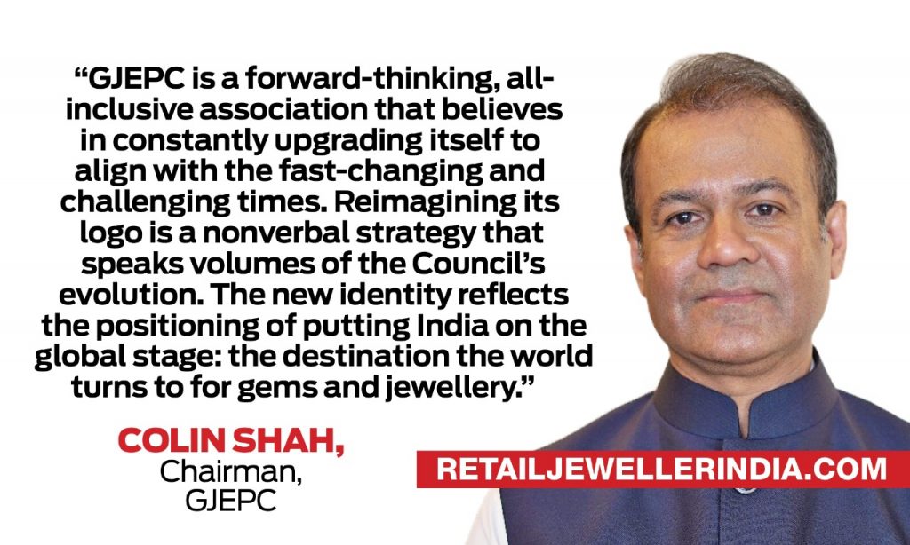
Colin Shah, Chairman, GJEPC said, “The Gem & Jewellery Export Promotion Council (GJEPC) is a forward-thinking, all-inclusive association that believes in constantly upgrading itself to align with the fast-changing and challenging times. Reimagining its logo is a nonverbal strategy that speaks volumes of the Council’s evolution.”
“The new identity reflects the positioning of putting India on the global stage: the destination the world turns to for gems and jewellery.”
Renowned agency ANC designed the new GJEPC logo. The circular symbol is representative of India’s ‘centrality’ to the industry, and GJEPC’s authority and importance as an apex body for the industry. The concentric circles represent a powerful force that radiates outwards from India, reaching out to the world. At another level, the symbol strongly connects to the category: gems and jewellery. The lines represent the facets of a cut gem. The font has the gravitas of an institution; yet has the elegance this category demands. It strikes a perfect balance between classic and contemporary, projecting GJEPC as an authoritative but forward-thinking Council with a contemporary view.
Colin further added, “Updating our corporate image was a necessity to adapt to the changing times. We had earlier changed our identity in 2011. Ever since then, the ethos of the Council has also evolved. Change is the only constant and only the ones who adapt to the change can survive and succeed. The new logo is a potent way to link the Council’s ethos of reliability, inclusiveness and dependability, which the industry has come to recognise over the years.”
“The new brand identity presents the GJEPC as an apex body driving sectoral growth by connecting government and trade and promoting Brand India on a global level through various initiatives. It denotes a union of our culture and a forward-looking industry body positioning India as a centre of excellence for the gems and jewellery industry.”
The new circular logo featuring neutral colours with extending spokes showcases the strong role that the Council plays as a facilitator between the industry and the Government. The design has the required attributes in projecting stability and yet having a modern outlook, which was amply proved during the pandemic when the GJEPC pushed for transactional digital solutions and conducted the world’s first virtual B2B buyer-seller meets and IIJS trade shows among others.

Milan Chokshi, Convener, Promotions, Marketing & Business Development, GJEPC said, “The logo should be symbolic of the stature of the Council. Also, it was time to evolve… the way brands globally are able to adapt to the new technology and these multitude of reasons impelled us to go into this exercise.”
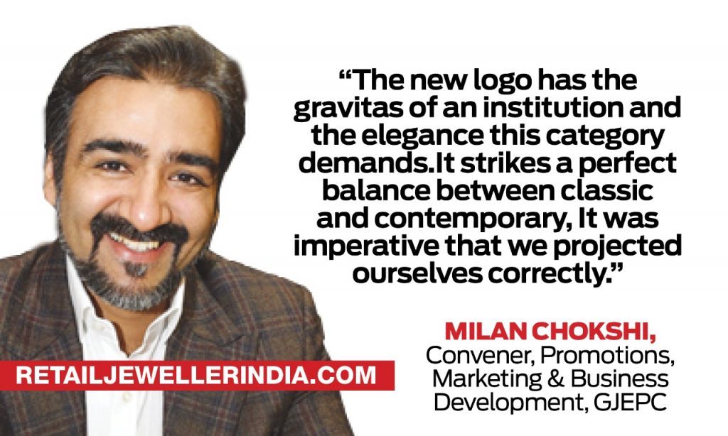
“The new logo has the gravitas of an institution and the elegance this category demands.It strikes a perfect balance between classic and contemporary, It was imperative that we projected ourselves correctly. It has a long shelf life as it portrays beauty, balance and stability – the core values that are symbolic of the role the Council plays in positioning the country on the global map as the epicentre for sourcing gems and jewellery.”
Courtesy: Retail Jeweller India News Service


 Daily News2 months ago
PC Jeweller to subdivide shares with 1:10 stock split amid record-breaking growth

 Daily News2 months ago
Kalyan Jewellers unveils limited edition ‘Pushpa’ collection ahead of Pushpa 2 release

 Daily News2 months ago
India’s gem & jewellery trade adopts terminologies under FTC guidelines of the US for diamonds and lab-grown diamonds

 Daily News2 months ago
Malabar Gold & Diamonds picks actor Manasi Parekh for its first Gujarati ad campaign, aimed at educating consumers


